
DIALOG element reaches full support
By Adrián Benavente, front-end developer & a11y analyst at Coderio.
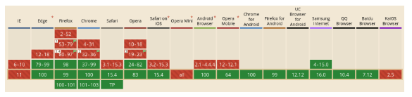
First, it would be Firefox 98 which, in March of this year, added support1 and Safari would do the same soon after with its most recent version, 15.42, thus passing the HTML5 <dialog> element to be supported by all modern browsers.
Main specifications
Category to which it belongs: flow content4, sectioning root5.
Allowed content: flow content.
DOM interface: HTMLDialogElement.
Context of use
It is used to represent a dialog box or modal window, either to inform the user of something important or to involve the user in some action or decision making. Both are inspired by the ones we commonly see in all operating systems.
Problems it solves
Besides the positive impact this feature brings on the user side, it also improves the development experience. Let’s see how:
ACCESSIBILITY AND USER EXPERIENCE
Pressing the Esc key closes the dialog, an interaction that any user -disabled or not- will always appreciate.
By default, the focus is automatically placed on the first focusable element inside, unless another is explicitly specified using the autofocus attribute.
When the dialog closes, the focus returns to where it was before (typically the button or element that triggered its opening).
On the other hand, for assistive technologies -such as screen readers- to communicate the purpose of the dialog to the user, it is enough to use aria-labelledby on the element, pointing to the id of its title or supply the text directly through aria-label. If this is not descriptive enough, you can use aria-describedby6.
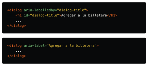
In this way, when the dialog is opened, its title will be announced followed by the word “dialog” (if not provided, only “dialog” is announced). Furthermore, of course, we can now forget about the use of role=”dialog”, since being a semantic label, its role is implicit, and it can only be changed to the more specific role=”alertdialog” 7 8.
Styles and interactions
Invoking the element’s show() method, the dialog is displayed without preventing navigation through the rest of the document. On the other hand, showModal() confines the user performing focus trapping until the close() method is executed. For example, when we press a button or Esc.
In addition, showModal() adds an overlay layer to hide the underlying content, which can be accessed by CSS for customization, via the ::backdrop9 pseudo-element.
If you want to know the state -open or closed- of the dialog, you can consult the (implicit) open attribute of the element, which returns a Boolean. A warning: you should never modify the value of this attribute or remove it. Firstly, because of the browser would completely lose track of the state, producing various undesirable effects10. Secondly, why would you want to do it if it is controlled “automagically” in the end?
Conclusions
At this point, and if you have some knowledge of accessibility, the series of advantages that this element brings will be more than evident to you. Until now, we had to have a number of considerations that, if neglected, could easily turn our manners into an accessibility nightmare.
Another option was to look for a library that provides accessible dialogs in exchange for giving up control over our markup or spending the time it was originally intended to save on customization.
In any case, it was necessary to make sure that the following is complied with:
-Indicate the role: so that assistive technologies can announce that it is a dialogue.
-Catch the focus -applies to modal windows-: this is, today, a practically artisan task and it consists of making, when advancing the focus with the tabulator key (Tab), after having reached the last interactive element of the dialog, it’s positioned over the first one again, and vice versa when going back with Shift + Tab, preventing the user from navigating to other parts of the document outside the modal window.
-Lock the rest of the document: for the same reason as in the previous case, in a modal window we want the user to focus on a specific action. For this, the most common practice is to make the rest of the content invisible to assistive technology users when the modal is visible, by adding aria-hidden=”true” via JS to a parent container and placing the element that acts as a dialogue on the outside. In addition, it is convenient to add the aria-modal=”true” attribute to the latter, in this way, the assistive technologies will notify that the rest of the content is inactive.
Then, remember to switch to aria-hidden=”false” or remove the attribute entirely from the node when the modal closes.
-Control the open/close state: to prevent the creation of duplicate dialogs or allow reopening a closed dialog in the mentioned document lock.
-Keep the reference of the element that opened the dialog: to return the focus to its original place when closing it.
We have probably found ourselves performing these tasks repetitively in the past. You could say that we won’t have to worry about them anymore.
However, as with any new feature, we should use them wisely. It is necessary to provide some kind of fallback for older user agents: live browser versions or supporting technologies whose update cycle is slower.
A good option, quite robust, can be a11y-dialog. There is also a polyfill, published by the Chrome team. Let’s not forget that backward compatibility is also part of accessibility.
At Coderio, from my role as a front-end developer & a11y analyst, we have embraced the adoption of new technologies to improve our service and daily work. These updates are allowing us to create inclusive content with the aim that it can be consumed by any human being, regardless of their physical or mental conditions.
So much so that accessibility is part of the company’s policies, and ranges from compliance with international standards when developing software to creating various job vacancies for hiring new staff.
Today, we find ourselves advancing with full conviction in that direction to continue generating changes at a structural level, both professionally and business-wise.
By Adrián Benavente, front-end developer & a11y analyst at Coderio.


